
Sepia & Grainy Film Wall Art Australia | Photo Prints


Eucalyptus Valley Light

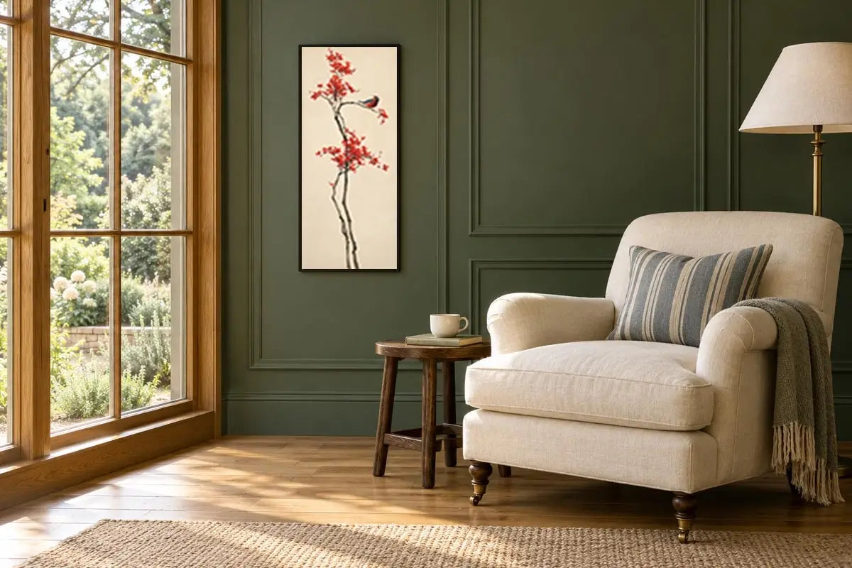
Scarlet Blossom Song

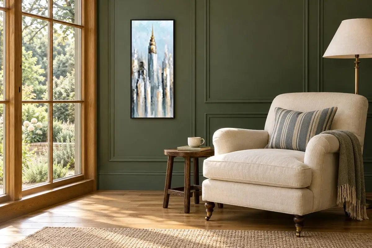
Gilded City Heights

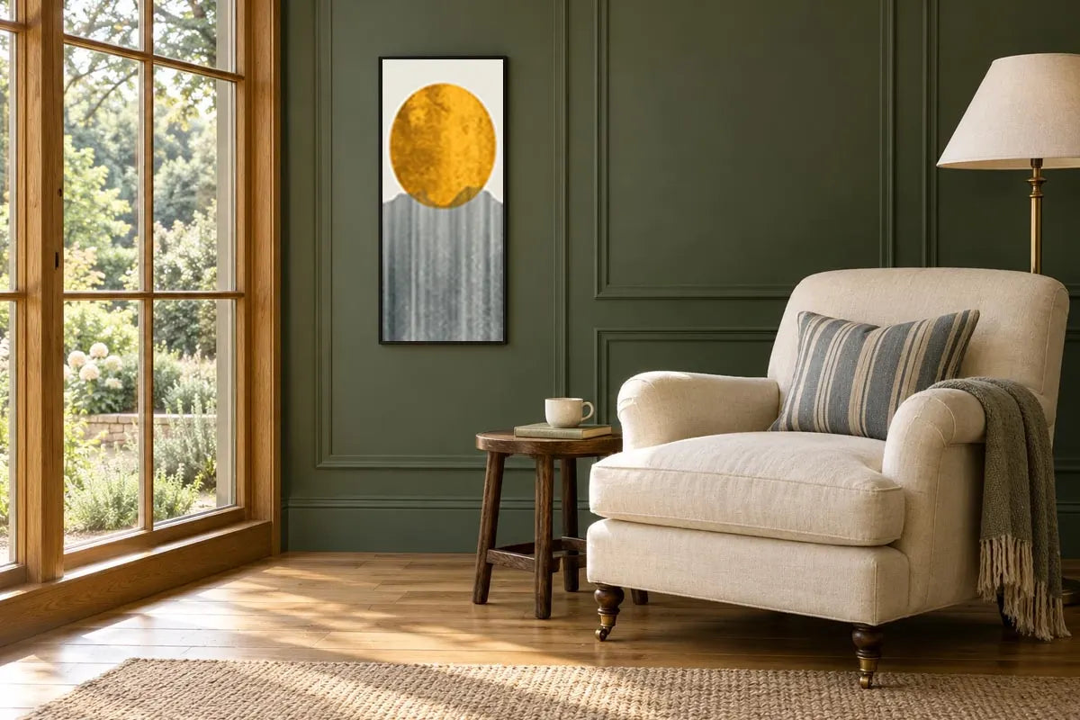
Golden Sun Geometry

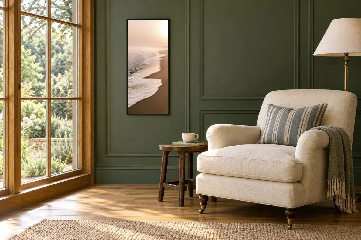
Blush Coastal Stillness

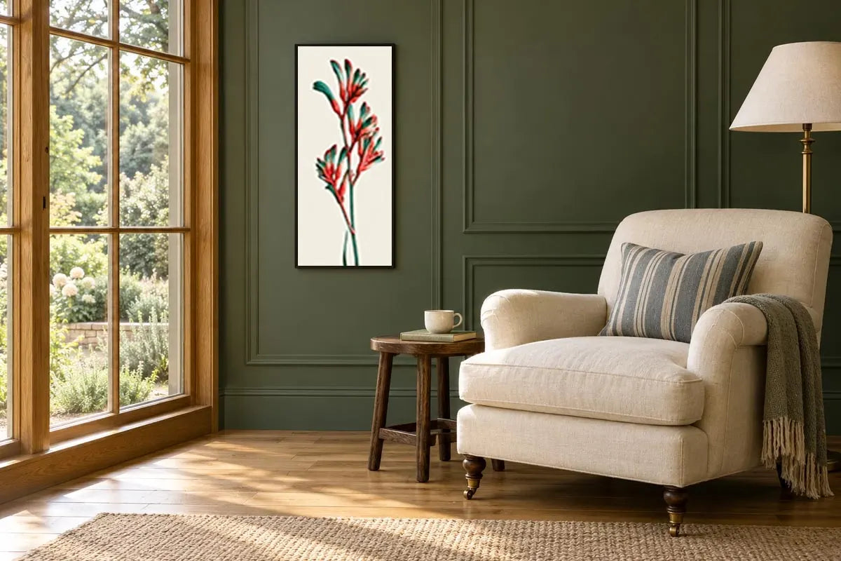
Crimson Kangaroo Paw

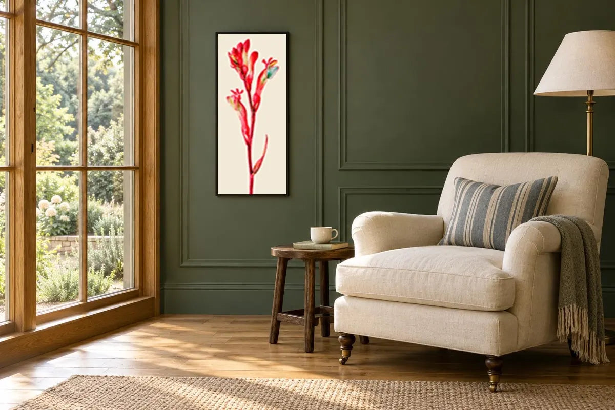
Scarlet Native Bloom

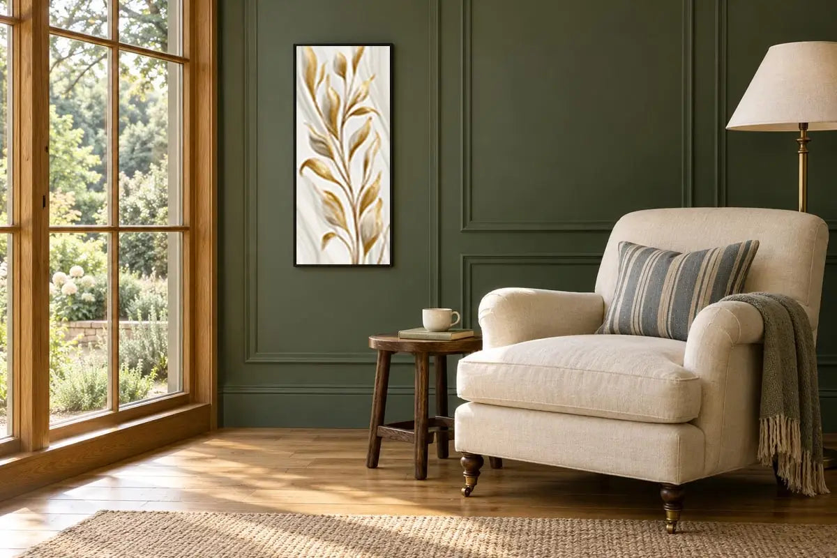
Gilded Botanical Grace

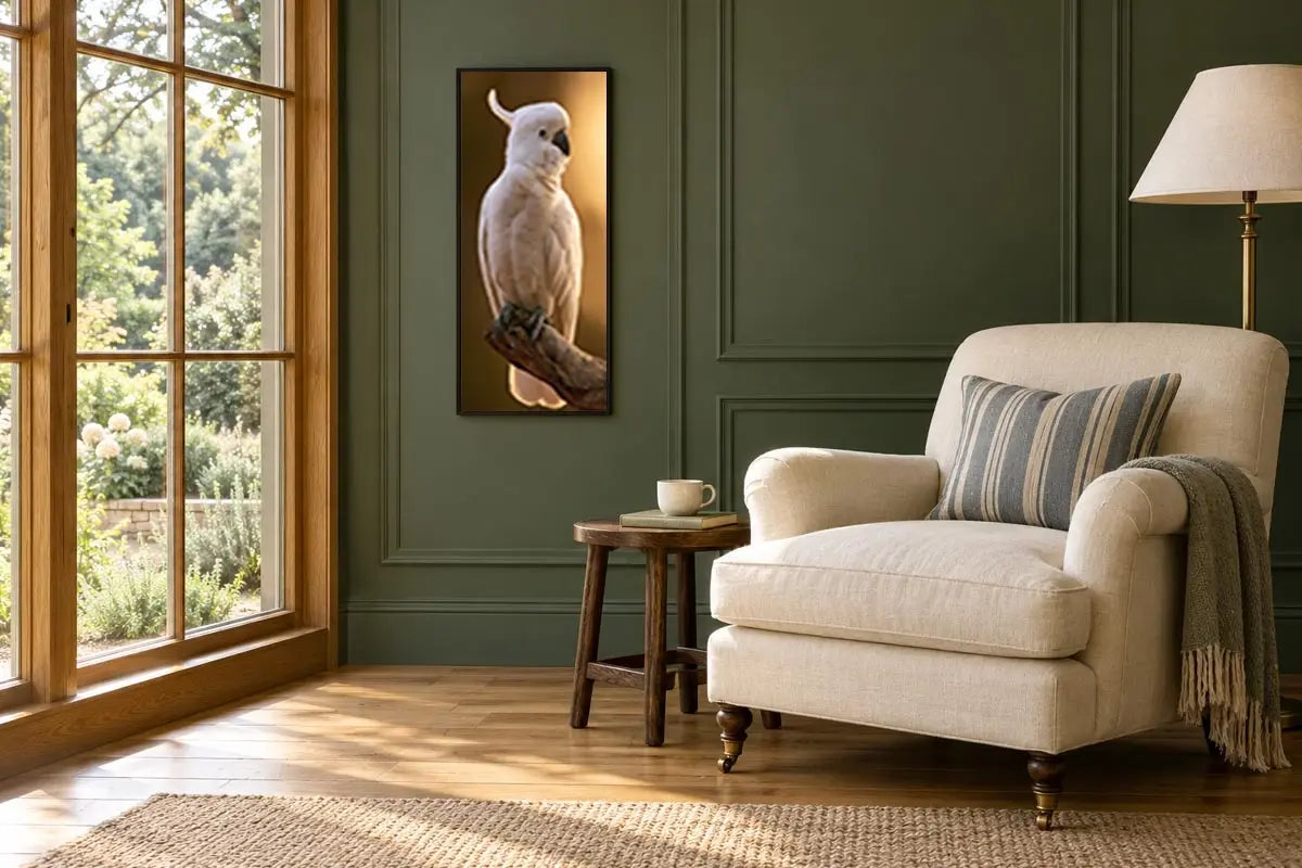
Golden Hour Cockatoo

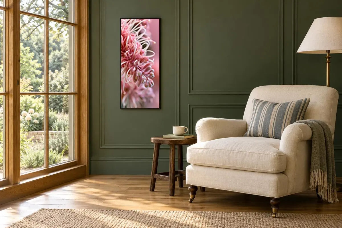
Blush Grevillea Detail

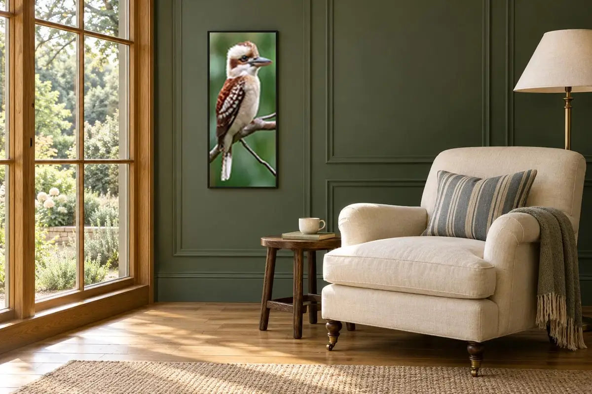
Kookaburra Quiet

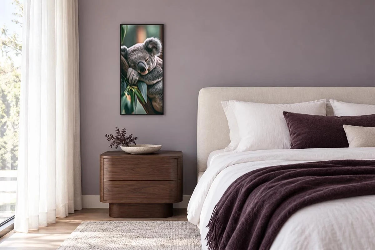
Eucalyptus Dreams

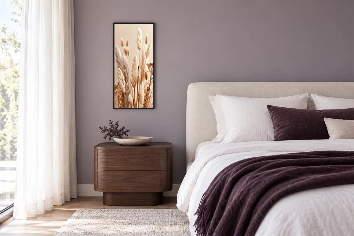
Whispers of the Pampas

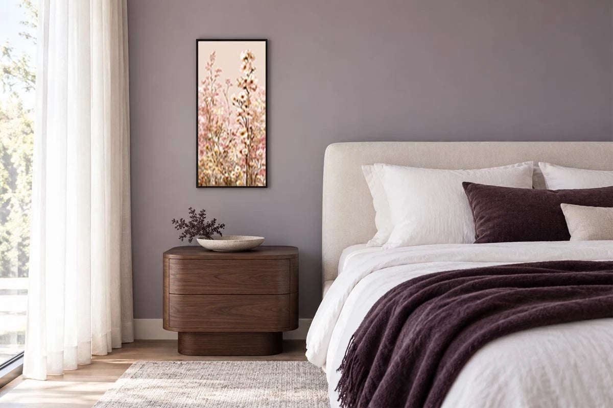
Blush Meadow Reverie

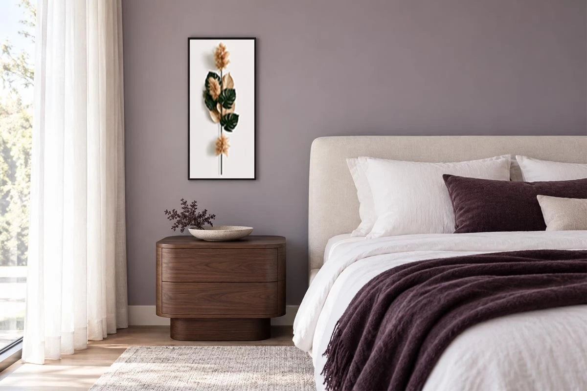
Botanical Poise

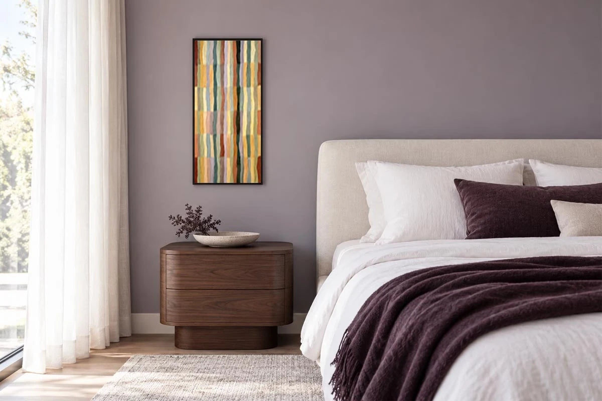
Woven Earth Harmony

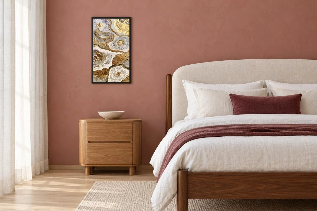
Golden Marble Currents

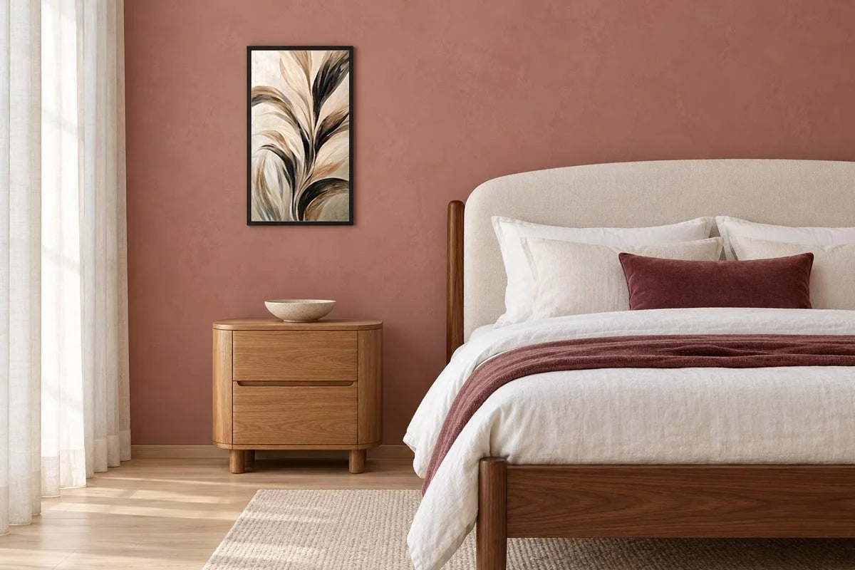
Whispering Earth

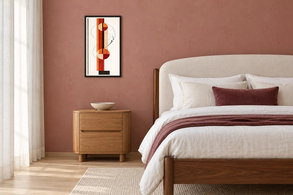
Terracotta Orbit

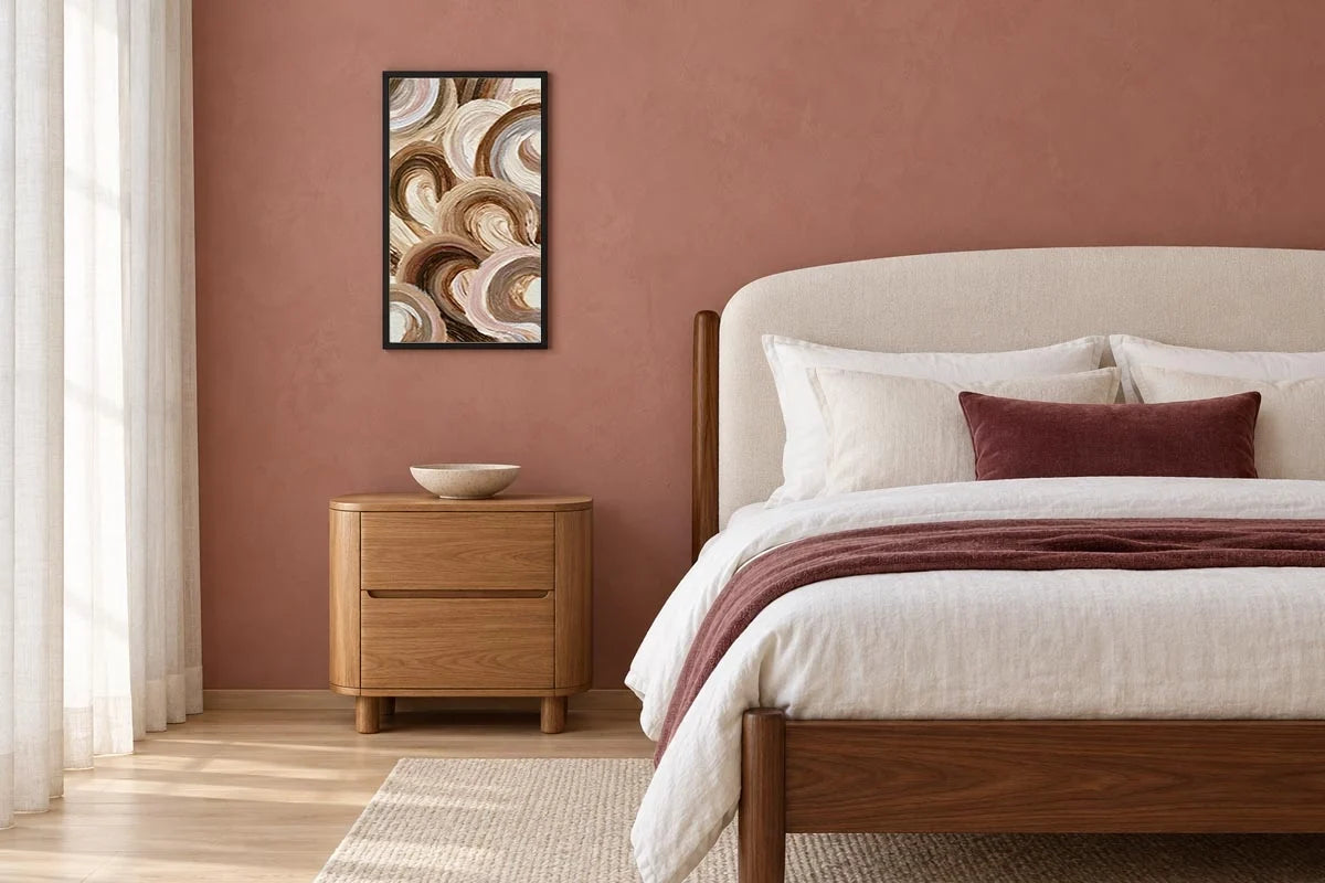
Earthbound Swirls

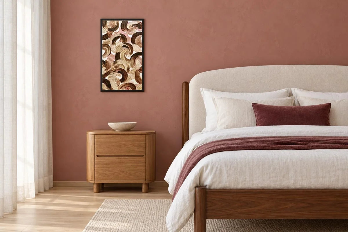
Mocha Rhythm

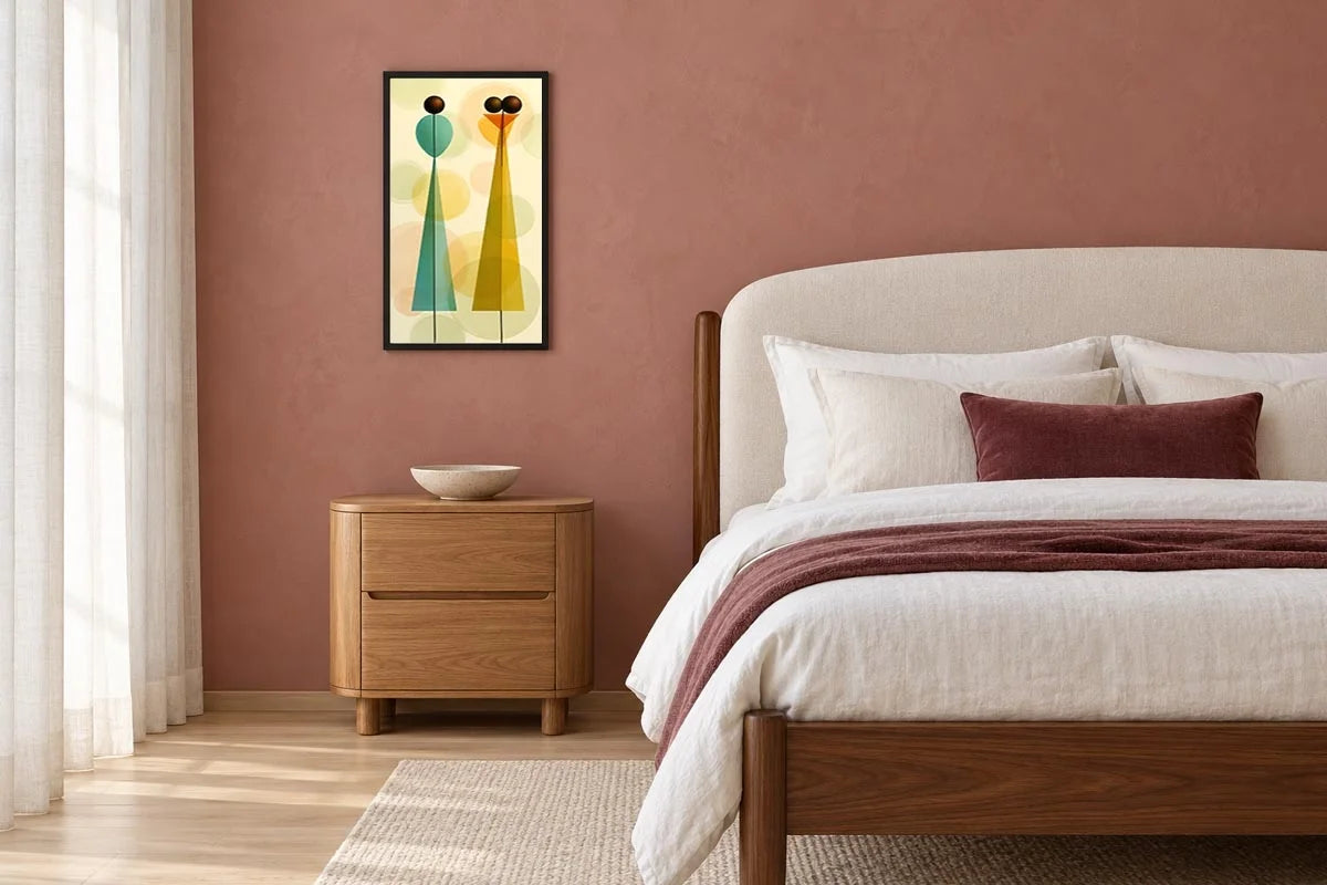
Golden Balance

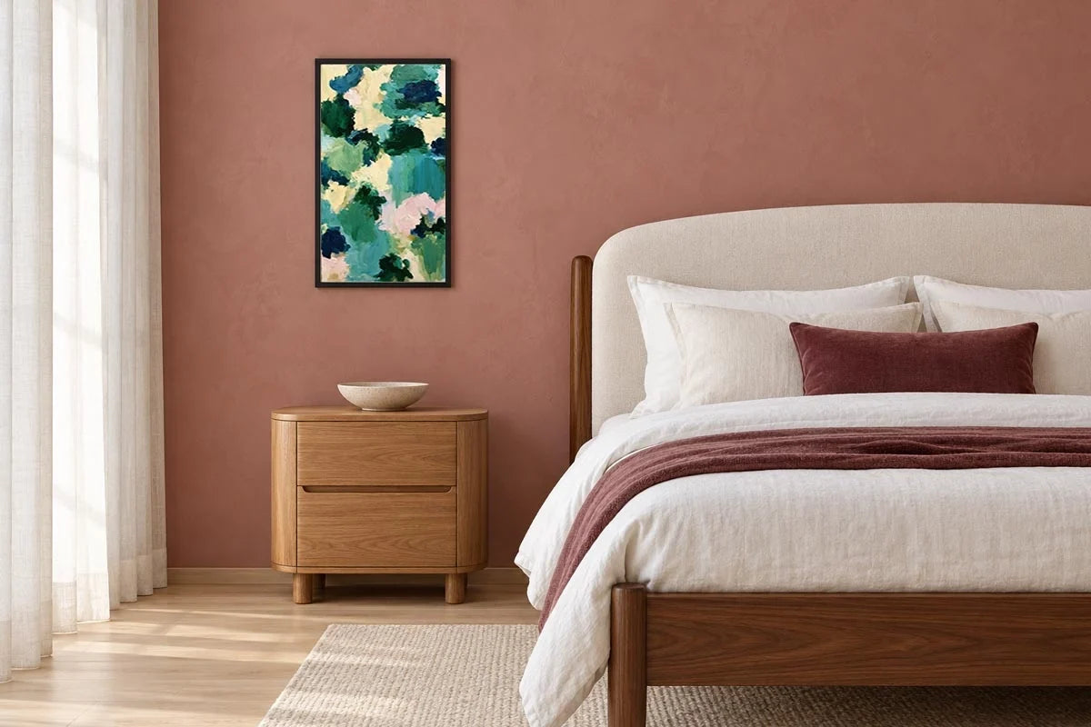
Emerald Garden Impressions

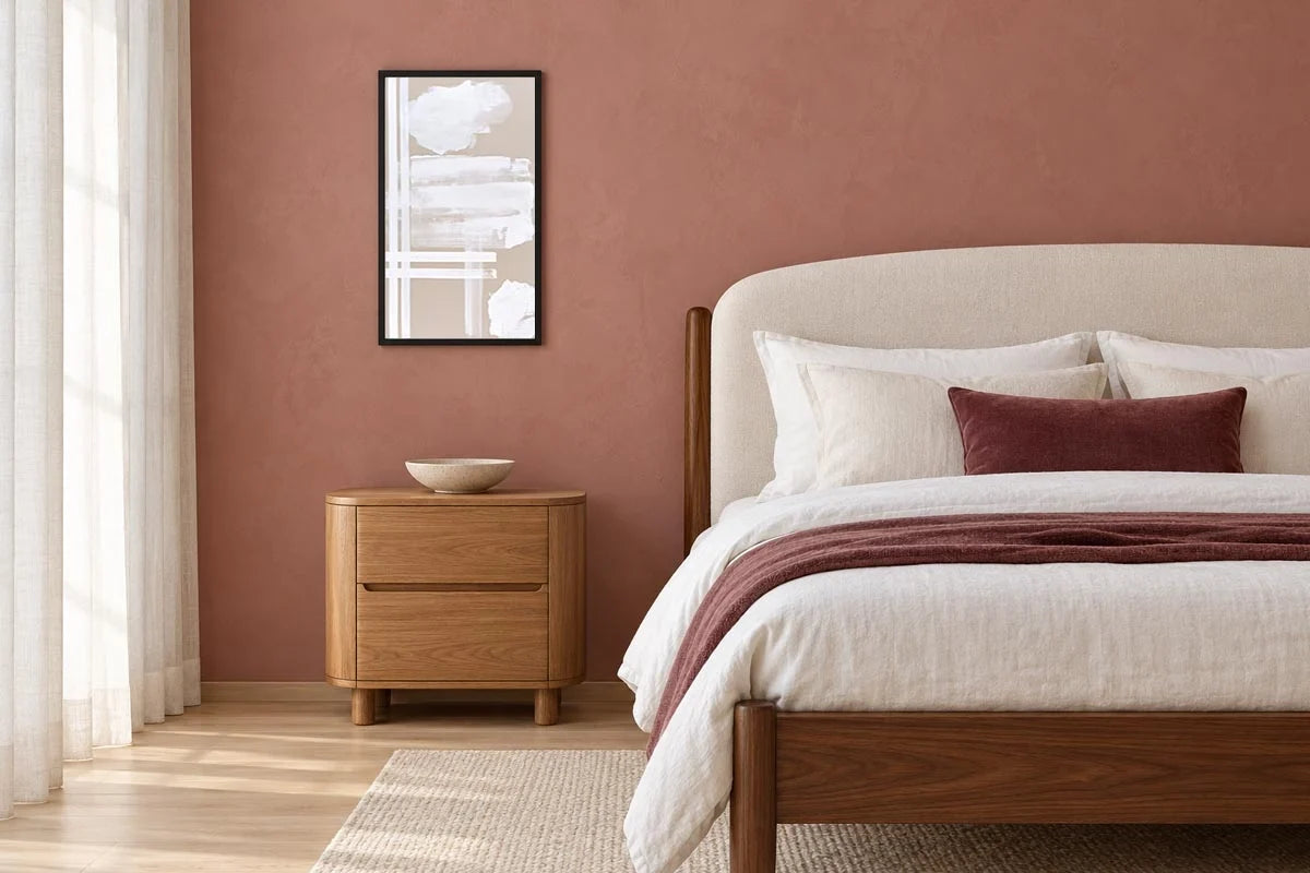
Ivory Strokes

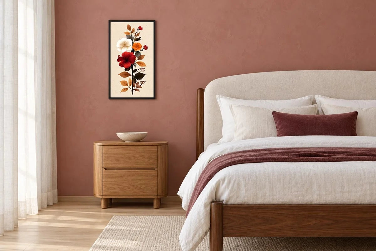
Autumn Hibiscus Reverie

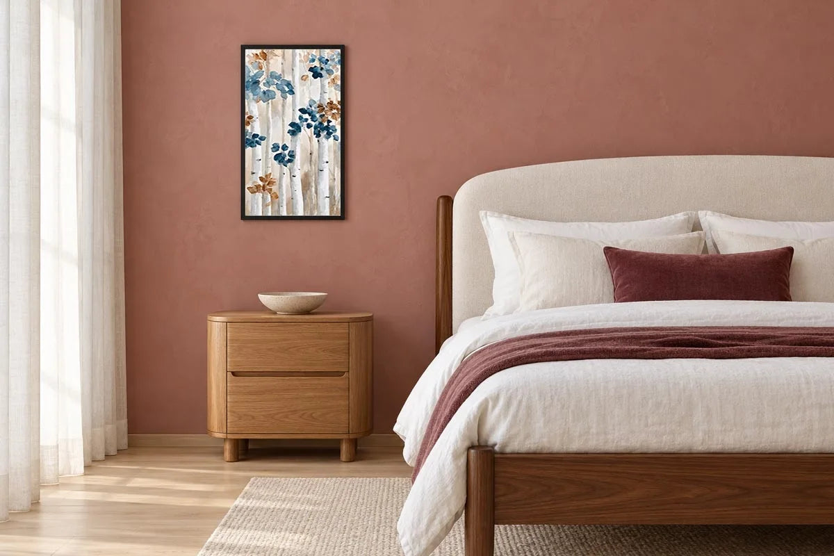
Amber & Indigo Birch

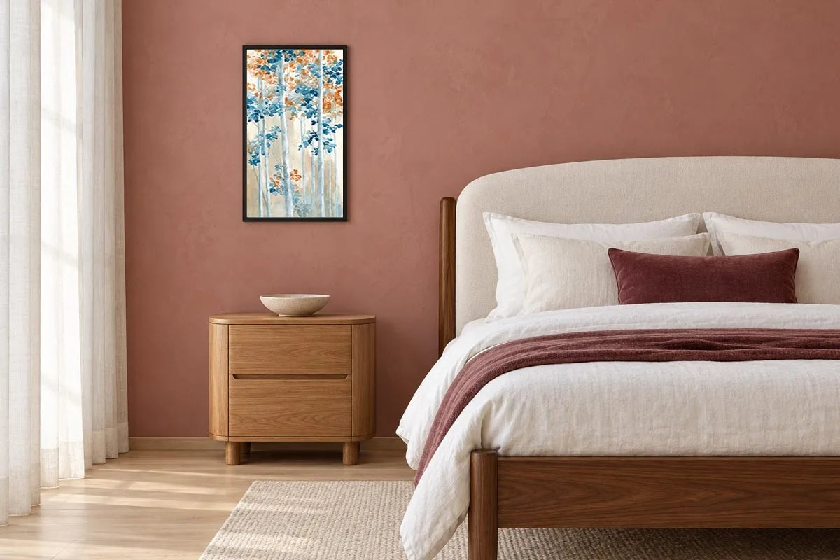
Amber Blue Woodland

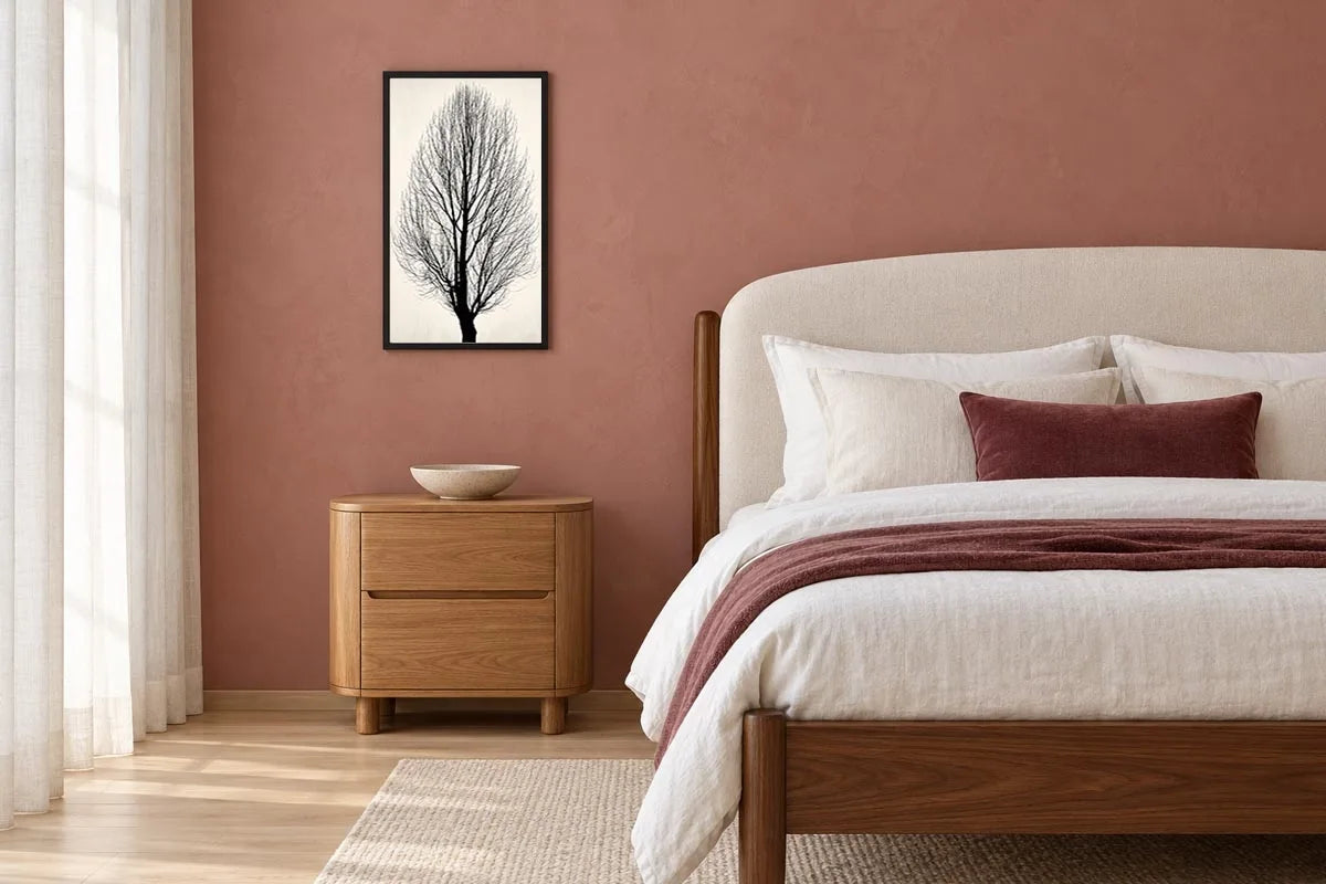
Winter Branches

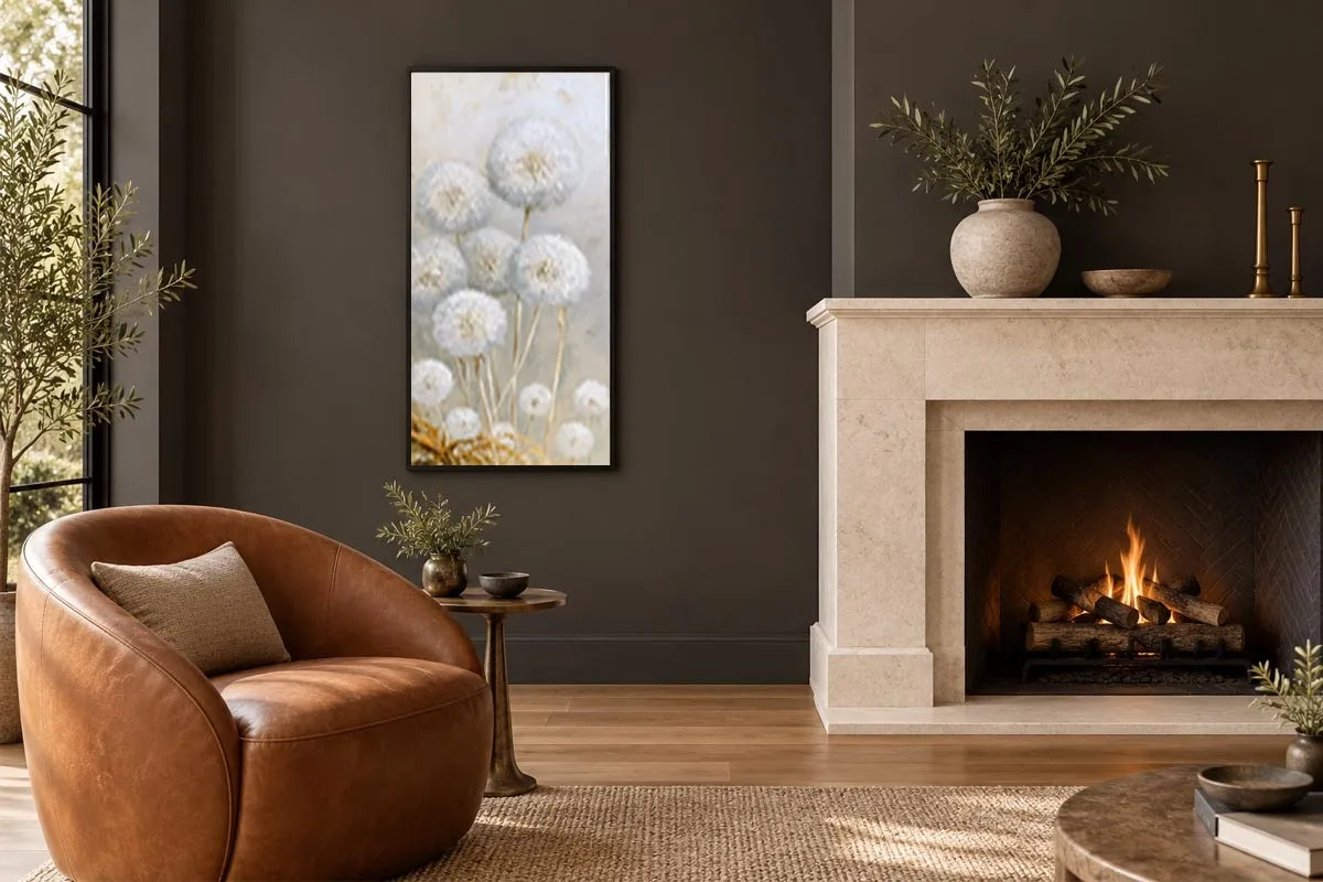
Whispers of Dandelion

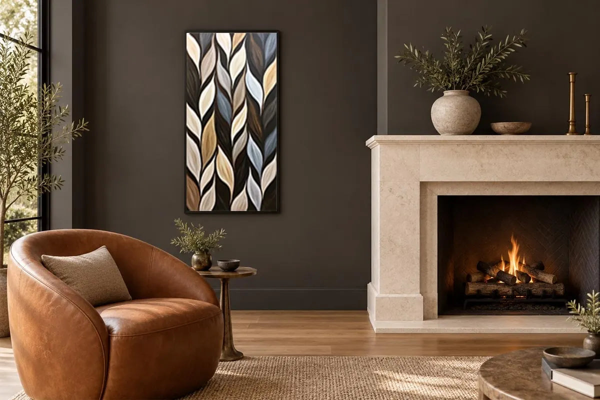
Twilight Leaves

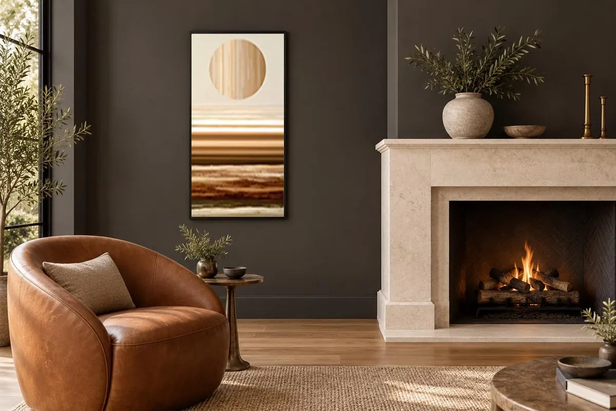
Amber Solstice

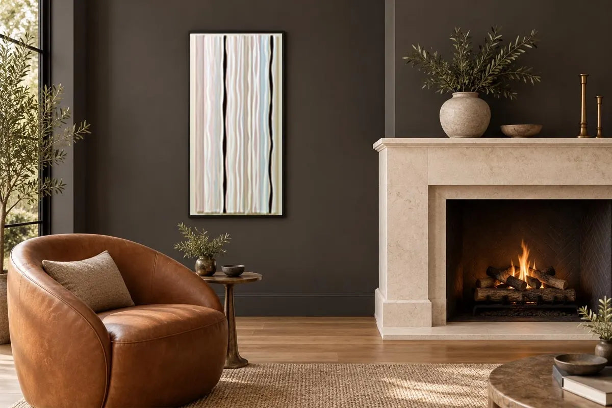
Quiet Lines
Bring tonal warmth and distinctive visual character into your home with sepia and grainy film wall art. Brown-tinted palettes, visible grain and expressive contrasts offer an alternative to brightly coloured imagery. Explore the Sepia & Grainy Film collection at Canvas Art Prints Australia and choose a piece you enjoy for its subject, composition and photographic style.
Sepia Artwork with Warmth and Depth
A sepia palette creates relationships between pale highlights, warm mid-tones and deeper brown shadows. This restrained colour treatment brings attention to shape, expression and light while providing a warmer alternative to black and white.
Start with the image that holds your interest. Consider its framing, focal point and surrounding details before looking at how its colours relate to your interior. The tonal treatment should support a composition you enjoy rather than be the only reason for choosing it.
Grain-Inspired Imagery with Character
Visible grain introduces variation across the image, becoming part of how its surfaces and details are experienced. A subtle grain may be most noticeable up close, while a more pronounced treatment can influence the entire composition.
Inspect the product images carefully. Grain, blur and softened edges are different qualities, and a particular artwork may combine them. Choose according to the effect you enjoy, especially when smaller features are important to your appreciation of the image.
Choose Your Tonal Style
Warm Brown and Sepia Shades
Brown-toned imagery can connect with timber furniture, leather and natural fabrics. Notice whether the composition leans towards lighter cream tones or deeper shadows, and how that balance will appear against your wall.
Stronger Grain and Contrast
A visibly grainy image with defined highlights and shadows can create a distinctive focal point. Consider how the texture relates to the subject and whether important details remain clear at your intended viewing distance.
Softer Atmospheric Images
Gentler tonal changes and less sharply defined forms create a different impression from crisp outlines. Look at how the composition guides your eye and choose a size that allows its subtler features to remain visible.
Styling Sepia and Film-Inspired Wall Art
In a living room, a tonal artwork can anchor the space above a sofa or sideboard. Relate its proportions to the furniture beneath it and check how clearly its main forms appear from across the room.
In a bedroom, warm shades can connect with cream bedding, woven materials and timber finishes. Balance the image’s detail with patterns already present in curtains, rugs and other textiles.
In a study or reading corner, position detailed work where you can appreciate its grain and tonal variations from your usual seat. Leave enough clear space around shelving and other objects for the image to remain distinct.
In an entrance or hallway, consider the view as you approach. A clear focal subject can remain effective from farther away, while finer details reward closer viewing.
Connect the Artwork with Your Interior
- Cream and warm white: provide a lighter setting for brown-toned imagery.
- Timber and earthy colours: connect with the warmth of a sepia palette.
- Charcoal and black details: echo deeper shadows and stronger outlines.
- Muted blue or green: introduce cooler contrasts alongside warmer tones.
Repeat a secondary shade from the artwork in a cushion, throw or decorative object for a subtle connection. Exact matching is unnecessary when the room’s overall palette feels balanced.
Select the Right Size and Orientation
Measure your available wall before choosing a size. Landscape compositions often complement wider furniture, while portrait pieces can suit narrower spaces. Follow the proportions of the original image as well as the shape of your wall.
Mark the proposed dimensions with removable tape and view the outline from the room’s entrance and usual seating positions. Check that the scale feels comfortable alongside nearby furniture.
Consider how grain and smaller details will read at the selected size. Enlarging an image may make its grain more noticeable; it does not necessarily make the appearance smoother. Review the product description and image details before ordering.
Compare Print Materials and Framing Options
Check the individual product page for its subject, image origin where stated, available sizes, materials and framing choices. Where canvas and paper options are offered, compare their surfaces and presentation.
For rolled or unframed formats, account for any stretching or framing you intend to arrange separately. A light frame can complement brighter areas, a dark finish can connect with stronger shadows, and a timber-toned frame can echo warmer colours.
For framed artwork, confirm whether the listed measurements describe the image or the finished piece. Use the overall dimensions when planning its position beside shelving, doorways or other wall art.
Create a Coordinated Photographic Display
Pair images through related tones, compatible proportions or consistent framing. Different subjects can work together when their contrast and visual weight feel balanced. A detailed image can also sit beside a simpler composition, allowing each piece to contribute something distinct.
Plan the arrangement before hanging. Keep spacing considered and view the grouping from across the room, giving each image enough space to be appreciated individually.
Sepia & Grainy Film Art FAQs
What is sepia wall art?
Sepia wall art features imagery with a brown-toned palette. Its appearance does not establish the image’s age, original medium or production method.
Does a grainy appearance mean an image was photographed on film?
No. Grain can originate from a photographic process or be introduced as an effect. Refer to the individual listing if the capture method matters to your choice.
Are vintage-looking images original vintage photographs?
Not necessarily. A vintage appearance does not establish age or provenance. Check the product description to confirm what is being sold.
Is image grain the same as physical print texture?
No. Grain may be visible within the reproduced image. The physical surface depends on the selected material and product specifications.
Explore sepia and grainy film wall art at Canvas Art Prints Australia, compare the available sizes and formats, and find a piece that brings tonal warmth and personal character to your home.